Serious Eats Design System
Developing a new design system and visual identity for a food and recipe website.
Company: Dotdash Meredith
Role: UX/UI Designer
Team: Design director, senior designer
Challenge
Rebrand site and develop a design system compatible with Dotdash’s existing infrastructure in order to support Serious Eats’ migration after acquisition.
What We Did
Refreshed brand visuals, logo, color palette, typography
Built new component library
Designed reusable page templates and content blocks
Results
Full site redesign, content migration, and relaunch in 4 months
Design system continues to be used and expanded years later
Project Overview
After acquiring Serious Eats, Dotdash wanted to refresh the brand and migrate the site (replatform) before relaunching it in a few months. The design team had to establish a new visual identity and develop a design system compatible with Dotdash’s existing infrastructure.
We worked with stakeholders to define a new vision for the brand before updating the site’s visual elements, such as typography and colors, and building a new component library in Figma. The new design system streamlined design and development for the relaunch and would evolve with the site for years to come.
Challenge
Context: Replatforming After Acquisition
Dotdash acquired Serious Eats in 2020 and wanted to modernize the brand before the migration and relaunch. (Serious Eats’ last major visual update was in 2015.) Dotdash owned 7 food websites and it can be challenging to balance brand differentiation with broad appeal. All sites owned by Dotdash shared backend infrastructure and an atomic design system with components variants for each brand.
Objective
The design team had to develop a new design system, which included visual design elements (logo, typography, colors, iconography etc.) and a UI component library in Figma. The design system components must be modular and compatible with Dotdash’s platform in order to grow with the site.

Site design since 2015
Defining Brand Vision and Outputs
Change is hard, especially for an indie brand with new corporate overlords. We started by engaging with Serious Eats and Dotdash stakeholders to establish a shared vision and project timeline. To update Serious Eats without alienating its core users, designers and stakeholders conducted branding exercises such as mood boards, “onliness statements”, and user archetypes before brainstorming solutions.
Serious Eats is the only subscription-free food website that has science-driven recipes, techniques, and product reviews for millennial home cooks.
Special Details
Stakeholders wanted to convey that Serious Eats was a “premium brand”, so we invested time into design details not found on other Dotdash sites, such as drop caps, illustrations, and custom content blocks.
Launch Priorities
I learned from developers how reusable components and design patterns were deployed across dozens of Dotdash websites. Together we identified high-priority elements for the relaunch deadline and planned for fast follows afterwards.

All Dotdash sites share a CMS and digital publishing platform. They display variants of shared library components, such as these content cards.
Visual Identity Refresh
Logo
The old Serious Eats logo was a combination mark with text inside a pot icon. It was pretty hard to read when scaled down. We redesigned a logo set to work across a range of media and scales. We also made the pot… look more like a pot than a briefcase.

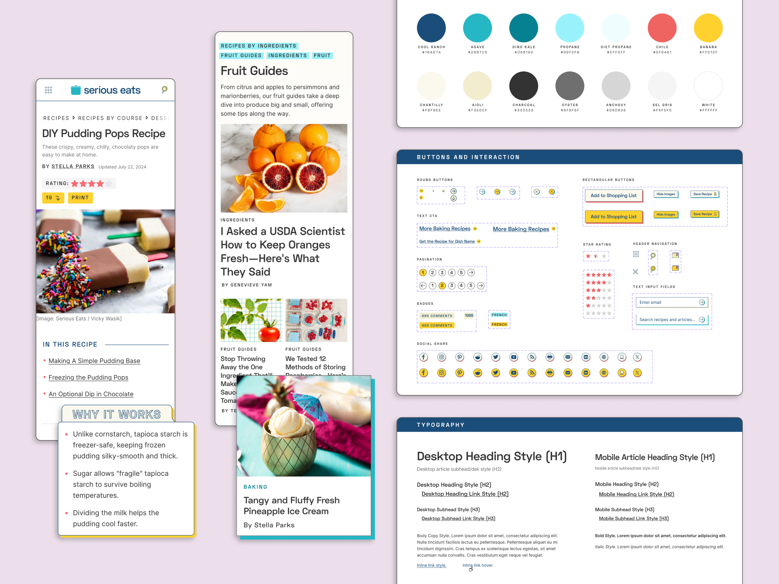
Colors
We tweaked the brand’s existing palette of bold, primary colors and added more shades of blue and gray to allow more flexibility throughout the site. We also made sure colors for text and interactive components met WCAG standards, limiting light colors to accents and borders.

Typography
To update the look and feel of the site and introduce more flexibility in UI design, we selected sans-serif Google fonts with variable weights.
New heading: Space Grotesk | New body: Inter
Previous heading: Adelle | Previous body: Effra

Design System Components
Serious Eats’ design team switched from Sketch to Figma after the acquisition. Figma made it easy to design components with variants for different screen sizes and states. By applying atomic design principles to reusable UI elements, simple “atom” components can be deployed quickly and combined into more complex “molecules”, such as a recipe header or a navigation menu.


Atomic components combined into more complex ones
Impact
The atomic component library helped designers and engineers develop new features quickly while keeping site styling details consistent. In May 2021, the Serious Eats team migrated and relaunched the site with a new look. The new design system will mature with the site and be used for years to come.
